A living room is more than just a place to sit. Your living room’s interior design, whether stylish and spotless or homely and haphazard, is an expression of who you are.
Though Ancient Egyptians started the trend of decorating their home interiors, the art of creating an inspiring space to live really took off in the west with the French Renaissance in the 15th and 16th centuries. And interior design has continued to evolve ever since. Here, we’ve created an animation and poster set to illustrate how interior design has changed over the past 500 years.
Which classic ideas will you use for your living room?
Renaissance (1400 – 1600)
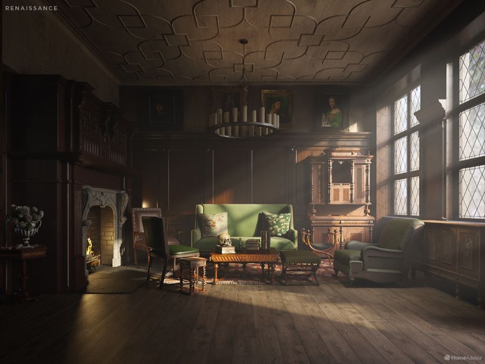
Art and culture were reborn as the French Renaissance spread across Europe. Architects found a renewed enthusiasm for ornate decoration and fine detail, inspired by a new sense of humanism and freedom. Arabesque and Asian influences revitalized the decorative arts, and careful attention to symmetry and geometry brought a new sense of harmony to European interiors.
We designed the cabinet in our Renaissance living room image in the shape of a small palazzo (palace) which was common at the time. Its columns and balconies echo the shape of the building, evoking harmony. The Turkish rug is inspired by one seen in a painting by Hans Holbein the Younger, a German painter who lived in Renaissance-era London. Rugs like this were first woven in western Turkey in the 14th century and became very popular in Renaissance Europe. The wood flooring complements the rest of the room nicely, and fits with the building materials available at the time.
Baroque (1590 – 1725)
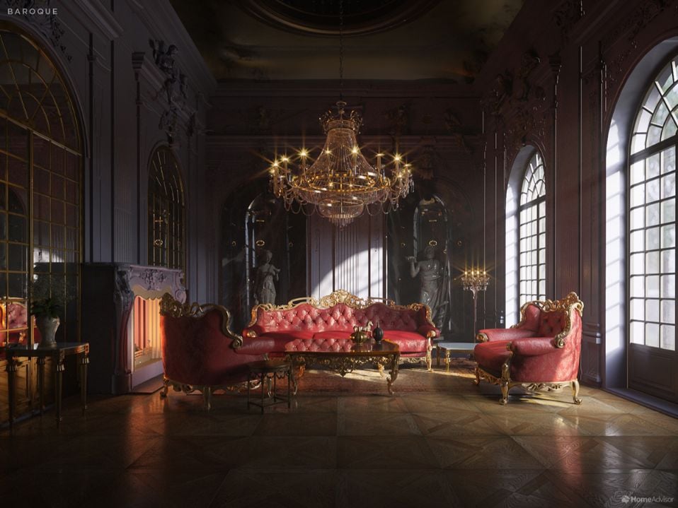
Turkish rugs fell out of fashion during the Baroque period, as more opulent and elaborate architecture required fixtures and fittings to match. The Catholic Church was the first to develop this new sense of affluence as an attempt to impress the uneducated masses with their wealth and power. Hence the frames of the Louis XIV-style suite seem to be dripping with gold.
Beneath the gilded finish, the frame of the furniture was often made from tropical wood. Other exotic materials such as ivory were popular, and surfaces such as floors and table-tops were usually marble. Natural stone maintains its popularity today, as homeowners increasingly install marble countertops in their homes along with slate and granite. Our color scheme here is dramatic and sensual. The play of light around a baroque living room would have been exaggerated to create a sense of movement and enormity.
Rococo (1700)
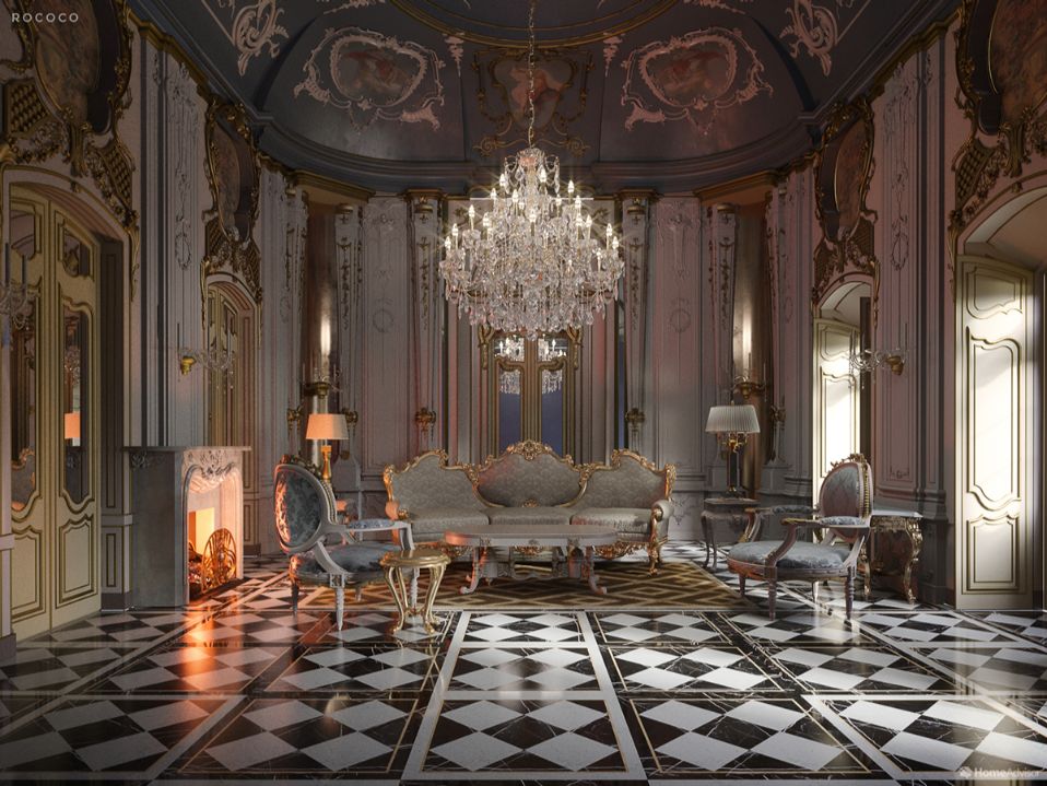
Towards the end of the Baroque period, a subset of the style briefly stole the limelight. Rococo style (from the French word rocaille, meaning shell ornamentation) was famous for just three decades during the reign of Louis XV. It is lighter, more whimsical, and freer than Baroque. For some, it better suited the intimacy of the family home than the grand church style that came before it.
The shell and floral motifs in our Rococo living room are typical of the style’s more playful influence on home décor. The black and white tile floor installation is sleek yet lively, and the cabriole legs and scroll feet of the furniture delicately balance high-spirits and elegance. Social gatherings in the home were becoming more common in the early 18th century. The Rococo style allowed homeowners to demonstrate their wealth and taste without appearing showy or stuffy.
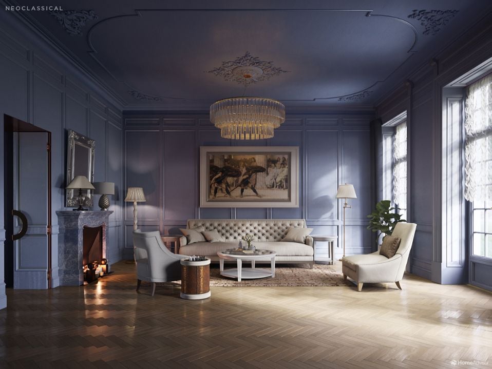
Neoclassical (1780 – 1880)
The late Georgian era ushered in a new age of architecture that responded to the Baroque and Rococo periods. The rediscovery of Pompeii contributed to new understandings of Roman and Greek architecture. This inspired a movement towards more ‘tasteful,’ refined, and timeless design principles, free from the pomp and novelty of the Baroque trend.
Notice the straight lines and logical, almost mathematical layout of our Neoclassical living room. These design principles were spread throughout Europe by artists studying at the French Academy in Rome. Note the column-like shape of the fireplace, lamps, and paneling. Colors were mild and undramatic. A plain palate emphasized the stoic, superior sense of form that the Neoclassical embodied.
Arts and Crafts (1860 – 1910)
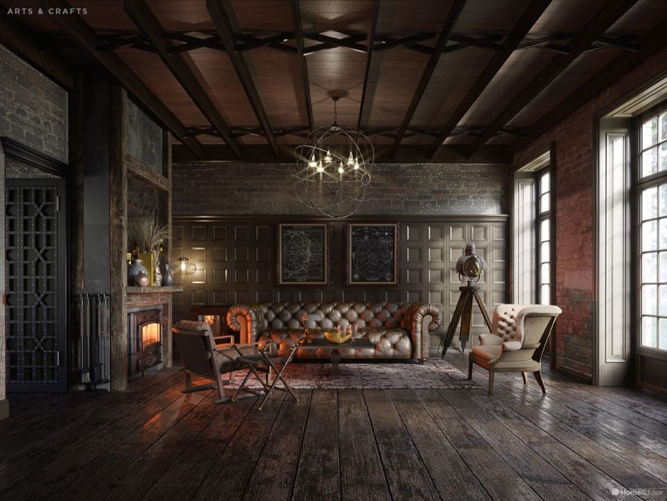
The Arts and Crafts movement began in England as a reaction against the mechanization of creativity and the economic injustices of the industrial age. It was not so much a style as an approach, putting the responsibility for design and craft back in the hands of skilled workers. However, Arts and Crafts interiors shared an aesthetic of simplicity, quality of material, and a connection to nature.
The ideas and look of the Arts and Crafts movement spread to American living rooms via the influence of touring architect-designers, journals, and society lectures. Gustav Stickley was America’s foremost Arts and Crafts designer. You can see his influence in the chunky, function-led woodwork of the furniture in the image, which makes a feature of exposed joinery. This emphasis on wood, brass, and the artisan’s touch gives Arts and Crafts interiors a dark, earthy, and textured palette. Hire a light fixture installer to mimic the look of this statement industrial chandelier at home.
Modernism (1880 – 1940)
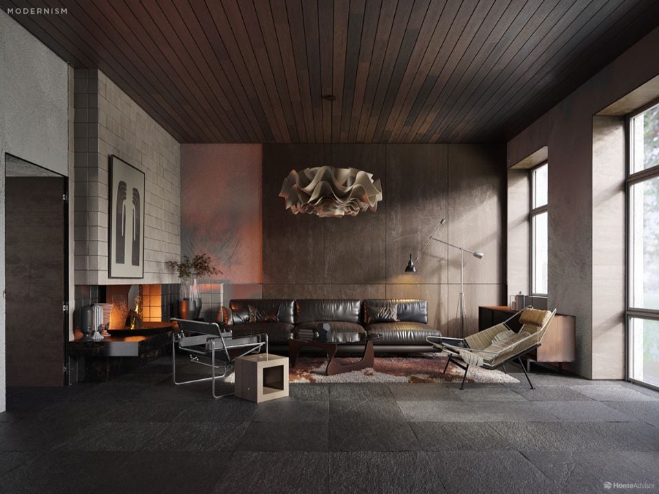
Like the Arts and Crafts movement, Modernism is less of a style than a philosophy. “A house is a machine for living in,” said Swiss architect and designer Le Corbusier, the pioneer of Modernism. The Modernist living room utilized the latest materials and technologies. It was designed to be comfortable, functional, and affordable. Beauty was a bonus, although elegant design solutions were highly valued.
These ‘limits’ proved inspiring to the first generation of professional ‘interior designers.’ The table you see above is inspired by a famous design by Japanese-American designer Isamu Noguchi. It consists only of a plate of glass, two identical wooden supports, and a pivot rod to hold them together. The original Anglepoise lamp was invented by an engineer who was inspired by his work on vehicle suspension – demonstrating the close connection between Modernist interiors and 20th-century industry.
Art Nouveau (1890 – 1920)
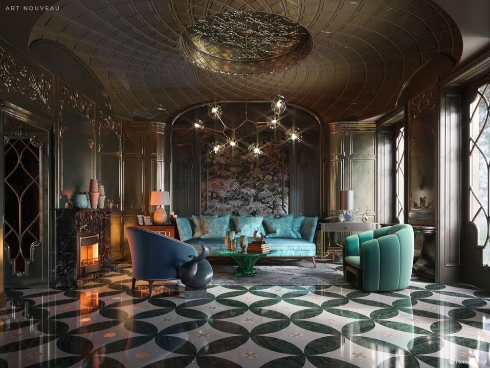
Art Nouveau was a ‘new art’ for a new century. Interior designers paired handcraft with new industrial techniques, which often made for an expensive process. Furniture and fittings were extravagant and modern, exhibiting the influence of Japanese art, which European artists were seeing for the first time near the end of the 19th century. A difficult balance to strike, this near-maximalist look can be achieved with the help of a local interior designer.
The vases and lamps in our Art Nouveau living room are inspired by Louis Comfort Tiffany, the celebrated artist and first Design Director at Tiffany’s. His glass-blown forms were a tribute to the natural world, and their lush, iridescent and swirling colors are typical of Art Nouveau.
Bauhaus (1919 – 1934)
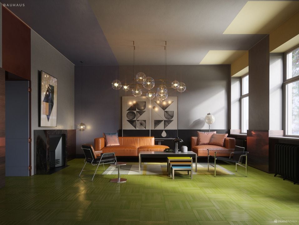
The Bauhaus (rhymes with ‘cow-house’) was a hugely influential German school of art and architecture. It existed for just 14 years until the Nazi government closed it down in 1933. Bauhaus design was a radical subset of Modernism, with greater emphasis on the human spirit and the craftsperson. As with Modernism, form followed function. Bauhaus interiors were true to their materials, meaning that they didn’t hide the underlying structure of a furniture piece to make it pretty.
Our Bauhaus rug is inspired by the work of Anni Albers, a graduate and teacher of the Bauhaus school. Albers experimented with shape and color to produce textiles that were equally art and craft. The lamp is modeled after the MT8 or ‘Bauhaus Lamp.’ Its circular, cylindrical, and spherical parts create geometric unity and can be built with minimal time and materials. This type of opaque lampshade had only previously been seen in industrial settings.
Art Deco (1920s to 1960s)
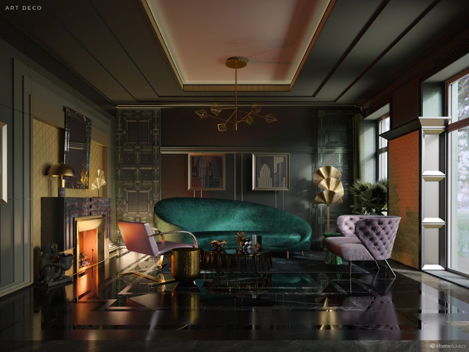
If Bauhaus and Modernism were the utilization of 20th-century advances, Art Deco was a glamorous celebration. Interior designers were inspired by the geometry and motion of the machine age, materials and symbols of ancient cultures, and rebirth in nature. And they weren’t afraid to use them all together.
Designers created a feeling of opulence by using a wide range of materials, including lacquered wood, stained glass, stainless steel, aluminum, jewels, and leather. Bold hues and striking contrasts conjured power and confidence, but this is a tricky color palette to pull off. That’s why you should hire a decorator to help with this look.
Strong, straight lines echo through the fireplace and mirror trim to the skyscrapers in the woodcuts on the wall. Note also how these lines boldly counterpoint the shell-shaped sofa, flowing chairs, and spiky ornaments and houseplant.
Mid-Century Modern (1930 – Today)
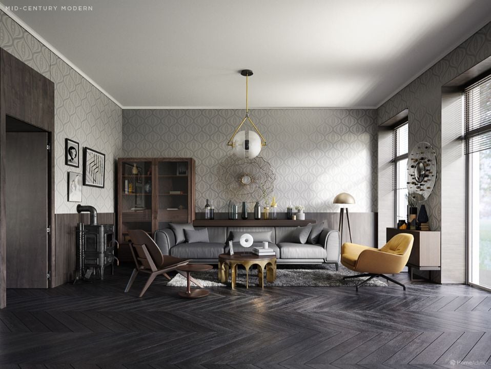
The Mid-Century Modern movement emerged as a softer, suburban take on Modernism, integrating natural elements. Interior designers introduced rustic elements and freer use of color inspired by Scandinavian and Brazilian furniture trends. Materials such as rattan, bamboo, and wicker felt both natural and modern when brought into the living room in the form of chairs, mirrors, and trim.
Statement lighting remains a simple way to add pizzazz to a well-used family living room. The lampshade and standing lamp in our picture both borrow formal elements from Modernism and Bauhaus but have the playful look of repurposed outdoor tools. The bright mustard of the armchair and vases exemplify the common Mid-Century Modern technique of pairing muted neutrals with a saturated signature color.
Postmodern (1978 – Today)
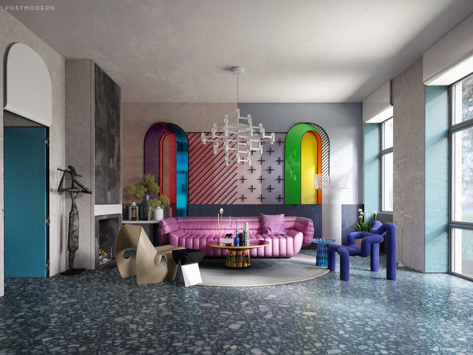
Postmodern design can trace its artistic influences from epoch-defining surrealist, Marcel Duchamp, to Pop Art’s crown jester, Andy Warhol, to the ambiguous Bad Taste of Jeff Koons. It all came together in the 1980s when designers threw off the shackles of Modernism and approached interiors with a sense of humor and the brash confidence we associate with the decade.
In a Postmodern living room, every piece is a talking piece – because each one has a double-meaning or visual joke to unpack. The arches in our image question classical ideals of form, both flattening and unflattening a traditionally austere shape with an optical illusion conjured by their irreverent color palette. The rug’s meaning is simpler. It adds a rock n’ roll feel with its vinyl record shape – a Warhol-like ironic celebration of late 20th-century materialism.
Contemporary (1980s – Today)
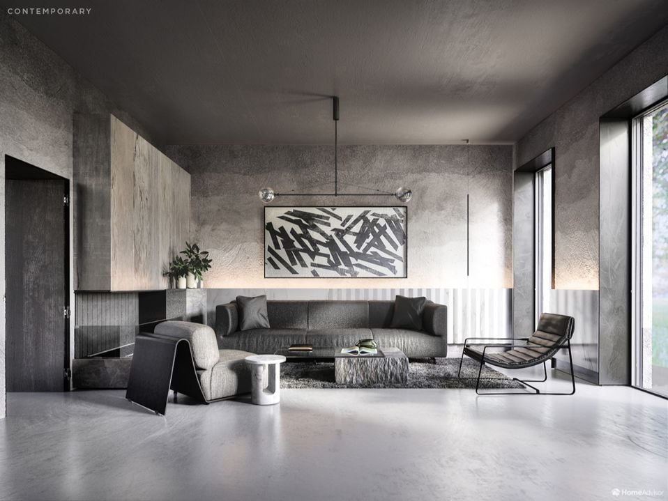
A cluttered age calls for a pared-back living room. Today’s contemporary style borrows the clean lines of Modernism and the airy, outdoors feel of the Mid-Century Modern home. Interior designers in the late 2010s love to give a nod to Bauhaus by peeling away surfaces to show the materials at work. However, today’s cutting-edge building materials and textiles can sit happily alongside repurposed industrial features from past eras.
The smooth, bare floor and uncluttered walls of our contemporary living room create a typical sense of space and light. Talk to a professional painter to achieve the look of these monochromatic yet textured walls. Abstract art prevents the area from feeling empty and draws out the subtle style of the otherwise minimalist surroundings. Observe, too, the use of line to draw your eye around, such as the horizontal central light, which is both extraordinary and very simple – and seems to widen and heighten the room.
Living room interior design changes dramatically as historical moments come and go. But the most exciting design trends of years gone by still have a part to play in how we decorate our living rooms. Which of these eras inspires you the most?
Sources
For a full list of the sources used for this piece, please visit http://bit.ly/500yearsofdesign


Are You Familiar With This Topic? Share Your Experience.