
The interiors of The Simpsons are as familiar as our own homes. It helps that the average family home looks a little… disheveled. Just like Homer and Marge, homeowners add random bits and bobs over the years, patching things up as they go along. Our rooms become more individual but less stylish with each new addition. D’oh!
The films of Wes Anderson show the same effect at work. His rooms reflect the characters who live there in a random kind of way. But in Wes Anderson’s universe, this randomness is refined into a style that is maximalist and minimalist all at once. How do the Tenenbaums, the Whitmans, and the Bishops do it?
HomeAdvisor decided to find out by remodeling interiors from the Simpsons’ universe in a Wes Anderson style. We analyzed Anderson’s aesthetic and applied his principles to the famous set-ups of 742 Evergreen Terrace, Moe’s Tavern, and Springfield Nuclear Power Plant. If your house looks more Simpsons than Tenenbaums, here is how to redecorate it for that chic-yet-personal appeal.
The Simpsons Family Living Room
A while back, HomeAdvisor showed you The Simpsons’ Living Room in six Interior Design Styles – from shabby-chic to mid-century modern. Here’s a seventh. That famous boat on the Simpsons’ wall been swapped for a common Montague Dawson reproduction (there’s a Wes Anderson character name for you). We’ve taken a tip from the Tenenbaums and filled the gaps with even more art. The weirder, kitsch-er, and more cramped your selection, the better.
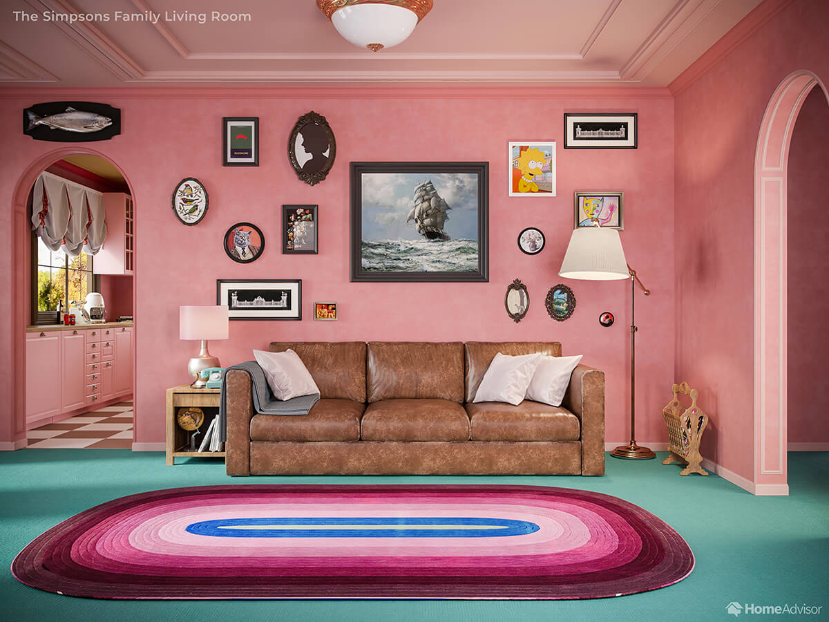
Remember magazine racks? Remember magazines? Wes Anderson does. So we’ve popped a charming teak number right where anyone else would have their Wi-Fi router. And Anderson’s Simpsons lounge features vintage (thrift store) lamps and light fittings for that antiquated look.
The Simpsons Family Kitchen
The Simpsons kitchen has gone ‘Fondant Fancy pink’ under Wes Anderson’s eye, a shade pinched from The Grand Budapest Hotel. It now looks like a place where you might actually want to sit down to eat! Reducing the number of colors in play instantly makes ‘random’ details like the vintage telephone look intentional and stylish.
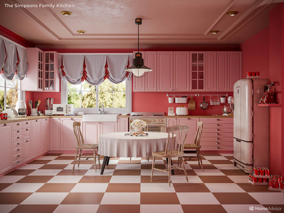
We’ve also made a feature of the hanging utensils. Hit the thrift store (again) to find a quirky (and random) saucepan, breadboard, and wooden spoon, and you have the start of your own Andersonian art exhibition-as long as you hang them neatly.
The fastest way to get this look for yourself? Paint your kitchen and install retro appliances to add nostalgia and whimsy.
Lisa Simpson’s Bedroom
There’s no shortage of prodigious children with super-stylish bedrooms in Wes Anderson’s universe. And if anyone deserves a Wes Anderson design upgrade, it’s Lisa Simpson. Her Tenenbaums-tinged bedroom is as pink as it ever was but now lined with Damask wallpaper so luxurious you may be reconsidering wallpaper vs. painting.
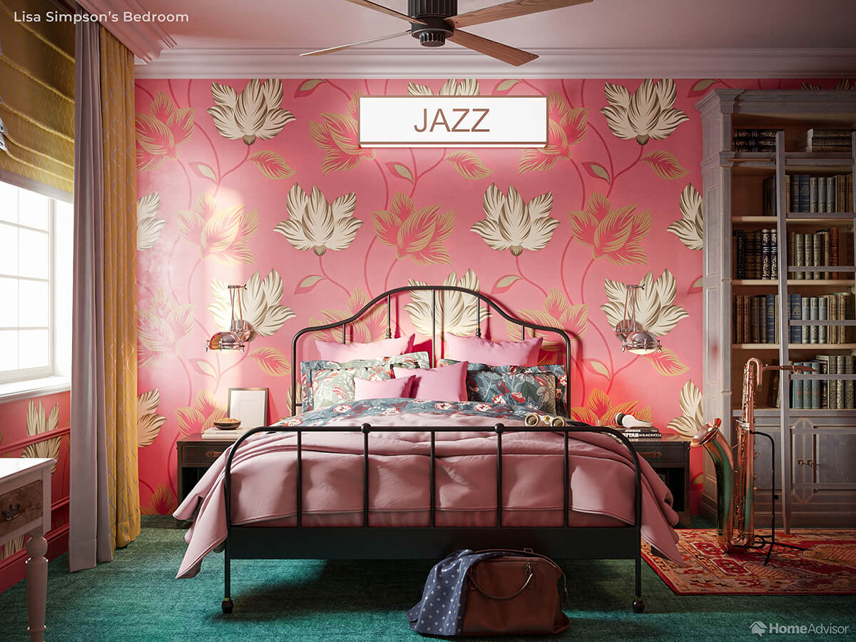
Somebody as bookish as Lisa deserves a dignified bookcase, so we’ve replaced her cobalt-blue Ikea monstrosity with a baby blue-stained vintage find. A wealth of clashing textures and patterns provides Lisa the constant stream of inspiration she requires.
Moe’s Tavern
Homer’s local has famously never been cleaned, but today it gets a full makeover. Wes’s Tavern is inspired by the faded imperial ‘glory’ of The Darjeeling Limited’s interiors, hence the ornate patterned windows and gold leaf paneled ceiling.
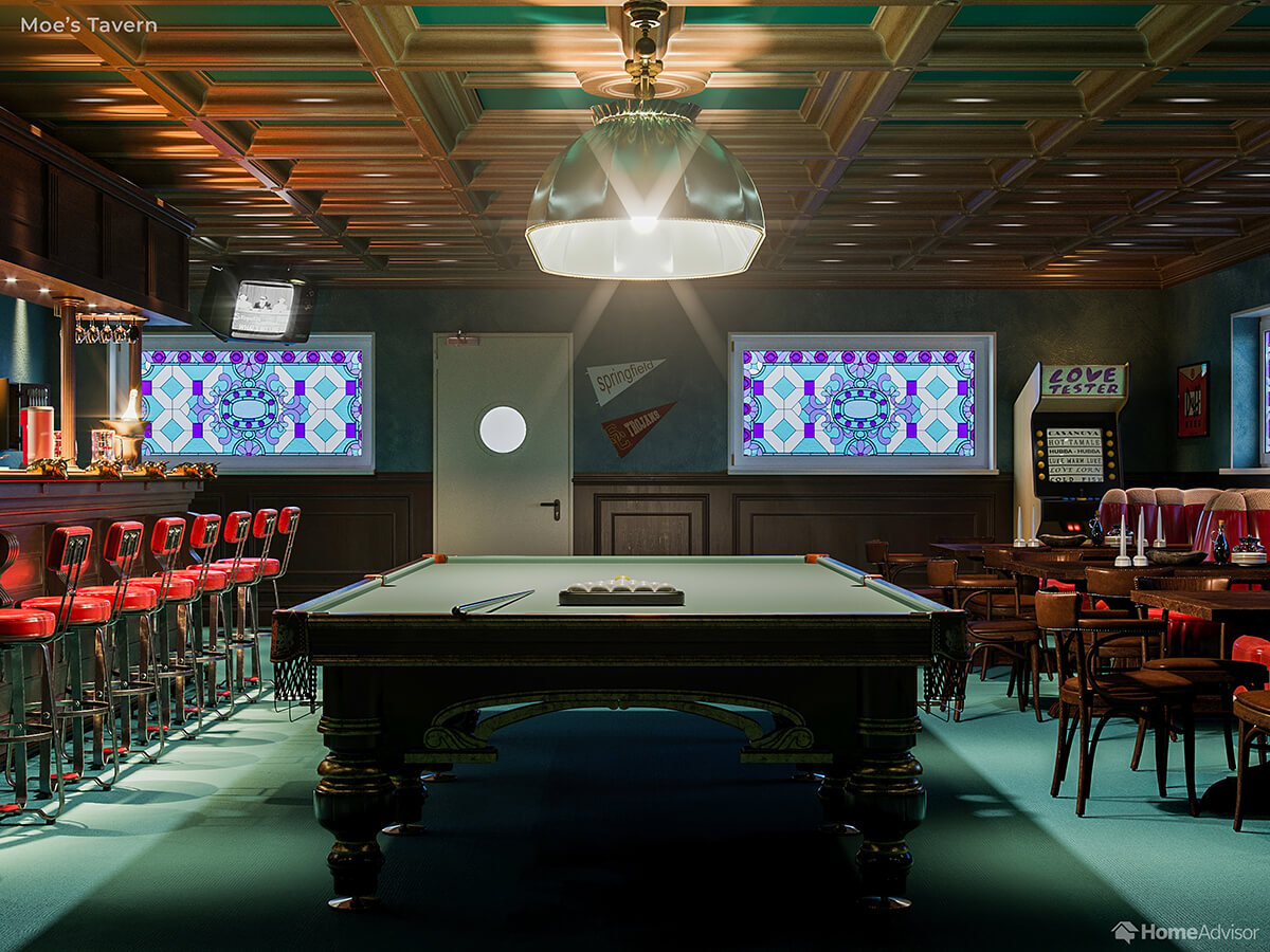
We were also inspired by Anderson’s lesser-seen short film “Hotel Chevalier.” While the filmmaker creates most of his locations from scratch, for this short he took Natalie Portman and Jason Schwartzman to the Raphael Hotel in Paris – where the symmetrical dining room was readymade for the Anderson aesthetic.
The Springfield Nuclear Power Plant Sector 7-G
Wes Anderson’s characters tend to be maladjusted geniuses and misunderstood artists. In the Simpsons, the workers of Sector 7-G are more likely to be schmoles, carbon blobs, boobs, cabbage-heads, and chair-moisteners. Is there really such a difference between these categories?
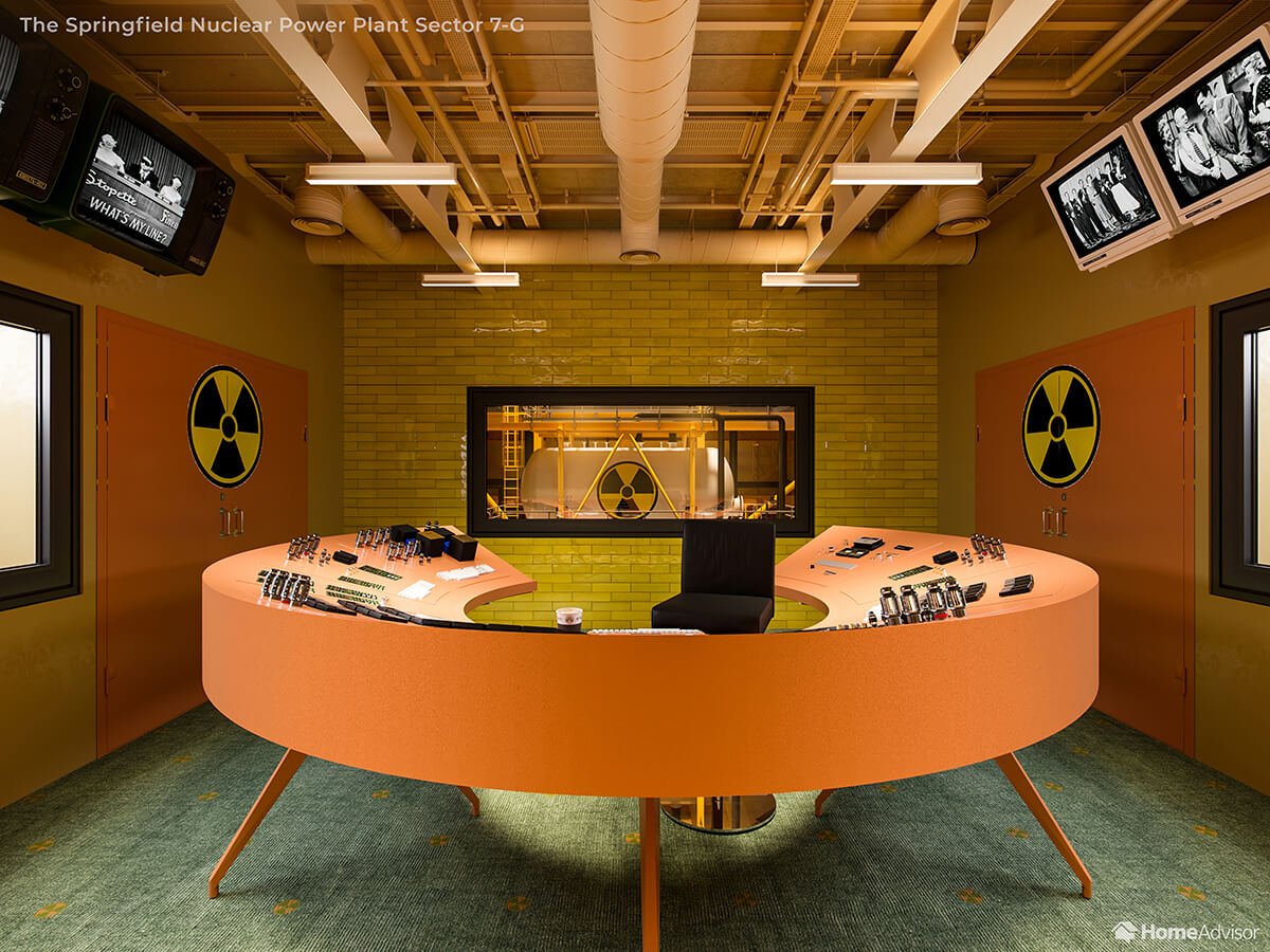
Even cabbage-heads deserve a pleasant work environment, so we’ve borrowed the look of the laboratory from The Belafonte (Steve Zissou’s boat in The Life Aquatic). And check out the radiation-themed carpet – its color is inspired by the weave in Jeff Goldblum’s office in The Grand Hotel Budapest.
Mr. Burn’s Office
Mr. Burns has the most Wes Anderson-ish interior in all of Springfield: the scale, the symmetry, the stuffed polar bear. But those colors need desaturating to pass in the Wesniverse, and the power plant boss/town despot needs a lot more clutter to become a Wes Anderson villain.
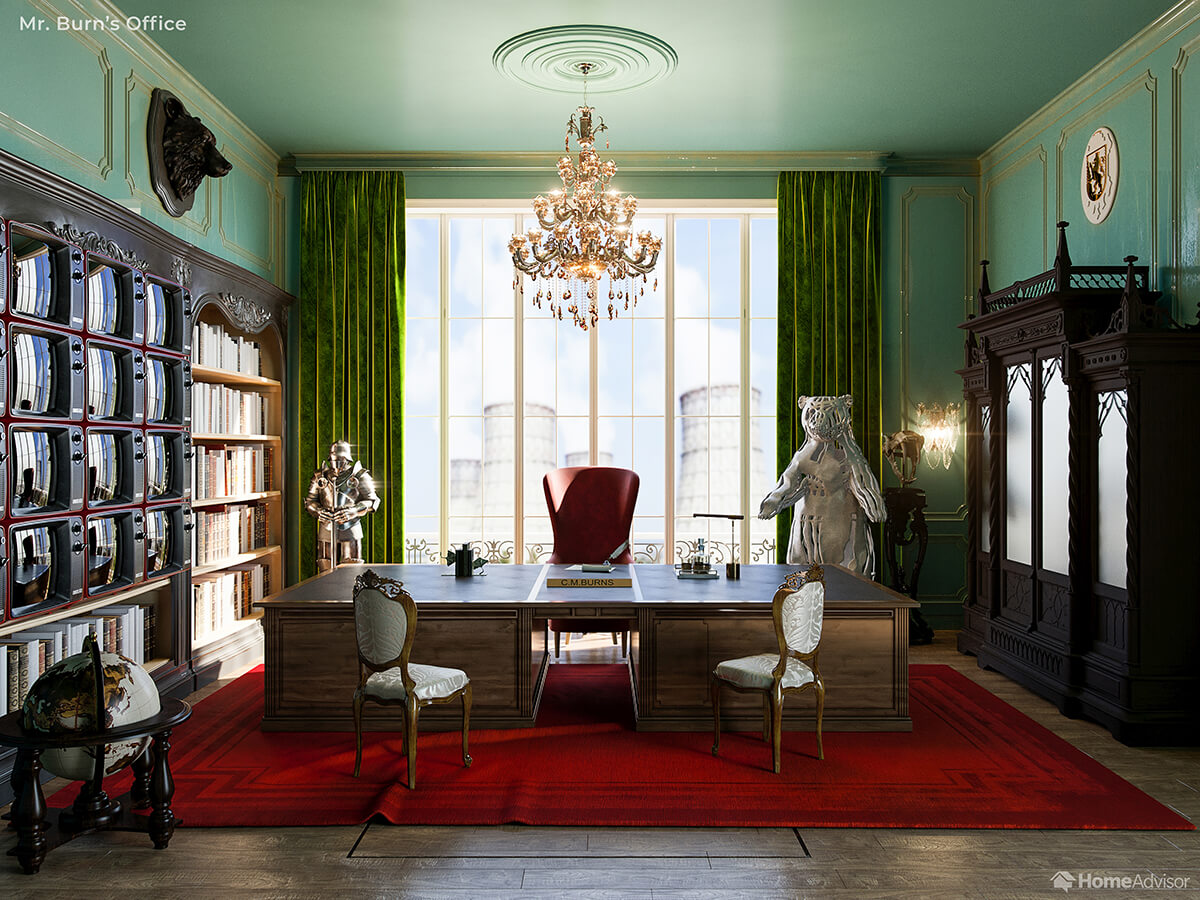
Any self-respecting billionaire would have a sterling silver bear (which happens to be one of the filmmaking awards that Wes Anderson has won) rather than rotting old taxidermy. And notice the rug is a little askew? Could that be a trapdoor underneath? Villainy!
Imaginary Worlds Apart
Rarely do the universes of Wes Anderson and Matt Groening meet. We know for a fact that Homer Simpson has never even heard of Wes Anderson (although Lisa has, and Ned Flanders “could be the dad in a Wes Anderson movie,” according to Springfield’s resident hipster). And both Anderson and Groening’s creations were kickstarted by the same producer: James L. Brooks.
But the interiors of Anderson’s films and The Simpsons are equally iconic and memorable – even if you’d only live in one of them. Which of Wes Anderson’s exquisite interiors will inspire your next redecorating project?
Sources
- Summersky, I. (2014). Hello Cat. commons.wikimedia.org
- Ruysch, R. (1704). Flowers in a Glass Bowl. 20×200.com
No Comments Yet
Sorry, comments for this entry are closed at this time.

