Each year, leading paint brands make their picks for the Colors of the Year, with hues chosen to complement everything from interior design trends to wellness and our connection to technology. They’re not just the colors you can expect to see on the cover of top home and garden magazines, but also the colors you can expect to find on kitchen appliances, furniture and the clothes on Fashion Week’s runways. Here, we’ve put together a few of the top-predicted hues for 2020 so you can start the new year — and your home decorating efforts — well ahead of the trend.
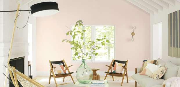
Benjamin Moore: First Light
First Light is the ideal color to brighten up a dreary space — this pale pink shade mimics the first light of dawn and features subtle blue undertones. According to Andrea Magno, Benjamin Moore’s Director of Color Marketing and Development, the color was chosen to represent a new dawn of idealism, design and living. The happy, optimistic shade can function as a neutral in a large room, or you can use it as an accent color if you’re not quite ready to commit to pink!
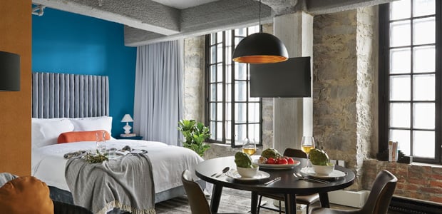
Sherwin-Williams: Naval
Naval is another Color of the Year inspired by the sun’s path – this rich navy shade reminds us of the night sky or the depths of the sea. This Art Deco-influenced hue works well on an accent wall or painted on kitchen cabinetry. Or, you can fill a whole room with the color for a dramatic, luxe makeover. A professional painter can tell you where this grounding shade will work best in your home (and help you avoid any DIY painting mishaps).
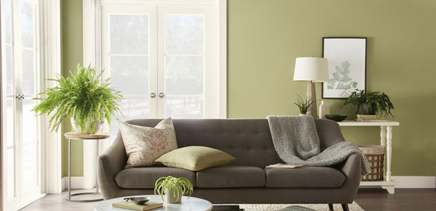
Behr: Back to Nature
Inspired by our desire to connect to nature, Behr’s meadow-green hue looks to bring the outside, inside. “Whether you’re biking on a forest path, canoeing on a lake or walking on the beach, green is prevalent in nearly every outdoor landscape,” says Erica Woelfel, vice president of color and creative services at Behr. “It is easily nature’s favorite color.” Try this shade on your front door for a breath of spring, or in your bedroom to help unwind.
PPG Paints: Chinese Porcelain
Dark blues are popular in 2020, and PPG Paints’ Chinese Porcelain is no exception. This moody cobalt was chosen for its calm, restful appearance to help impart slowness and realness into our lives, according to Dee Schlotter, senior color manager, PPG paint brand. “The need for simplicity and escapism from technology is in part, the reason that consumers are craving blues.” Paint this shade in a foyer to create a grand entrance, or in rooms with white trim to make the color pop.
Valspar: 12 Natural Hues
This year, Valspar selected 12 separate Colors of the Year to create an earth-inspired palette. Winter Calm, Mint Whisper, Canyon Earth, Grey Brook, Tempered Sage, Desert Fortress, Secluded Garden, Bombay Peach, Pale Powder, Utterly Blue, Crushed Out and Secret Moss make up the collection of soft shades. According to Sue Kim, Valspar color marketing manager at Sherwin-Williams, natural hues are earth’s prescription for the chaotic, busy lives we live. With so many options to choose from, these gentle shades can go almost anywhere in the home.
Pantone: Classic Blue
Classic Blue is a true, solid blue chosen for the way it promotes stability and peace in the home. “[It’s] a solid and dependable blue hue we can always rely on,” says Leatrice Eiseman, executive director of The Pantone Color Institute. This color adds dimension to a room, so try it out on cabinets and shelves. Or, paint it in a bedroom or office to create a place where you can focus and relax.
 Creating a Kid’s Fantasy World With Themed Murals
  Lead Paint Common Sense
  Painting Your Home Happy: How Color Choices Affect Your Mood
  Exterior Painting Techniques
  Choosing Exterior Paint Colors

Are You Familiar With This Topic? Share Your Experience.