Paintings of historical interiors are fascinating hybrid images — midway between the work of a great artist’s imagination and a document of the past.
While famous artists often worked from ‘real life’ scenarios, paintings such as Vincent van Gogh’s ‘The Bedroom’ or Kandinsky’s ‘My Dining Room’ are dubious historical records. They tell us as much about the painter’s state of mind as they do about decorating trends of the 19th or early 20th century.
For today’s artistically-inclined interior designers, the existence of such paintings is a gift: the chance to see forgotten furniture and color combinations through the eyes of a genius. For everyone else, imagining how those rooms might look in real life takes a bit more work. We decided to create realistic, character-generated (CG) renders of six of the most famous paintings of historical rooms.
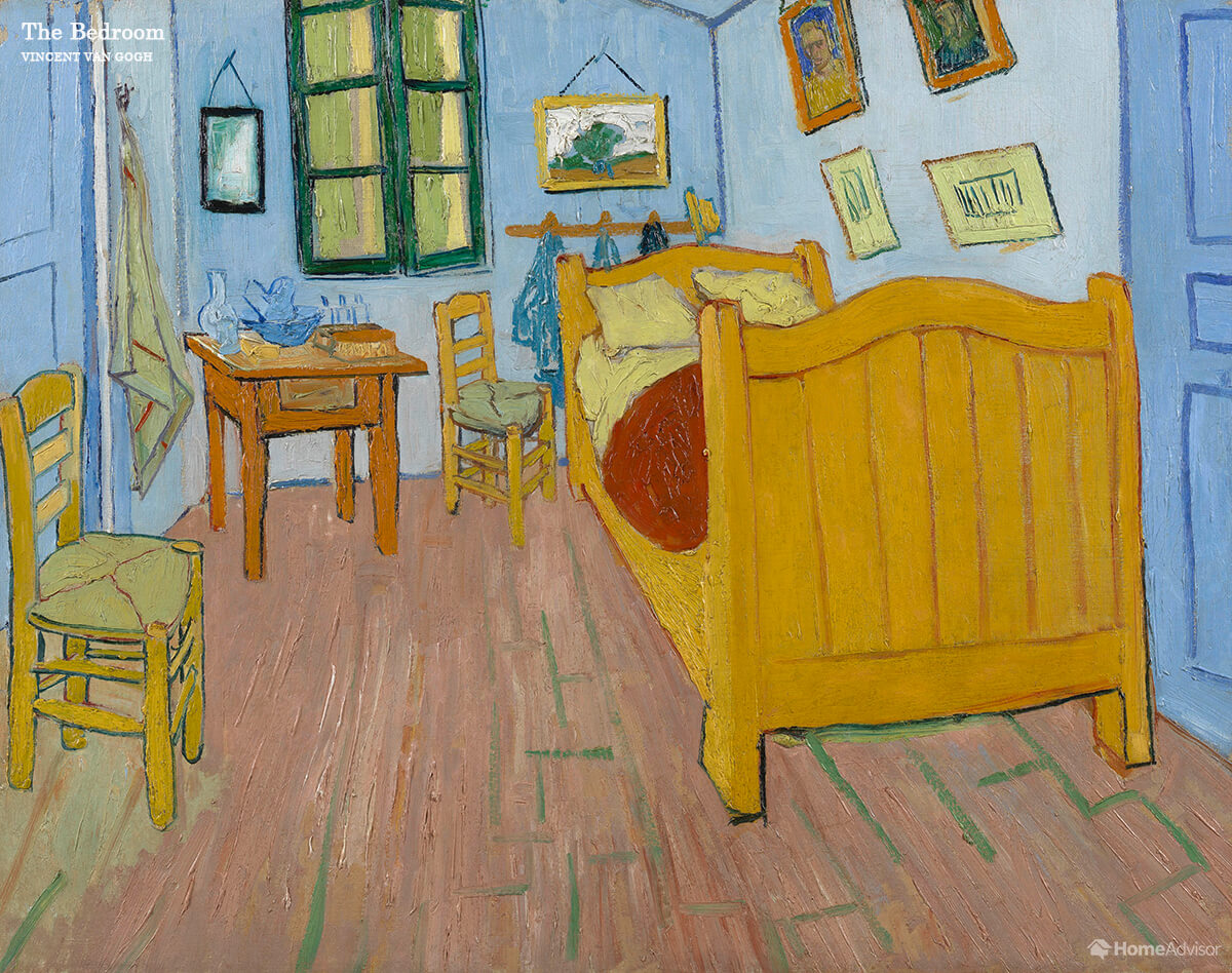
Bedroom – Vincent Van Gogh’s ‘The Bedroom’
Van Gogh described the painting of his room in the French town of Arles as an evocation of peace and relaxation. The simplicity of the furniture and wabi-sabi feel of the chipped paintwork on the walls and floorboards instantly feels calm and unpretentious. The blue paint brings to mind Classic Blue, Pantone’s 2020 Color of the Year, and proves that some hues really are timeless.
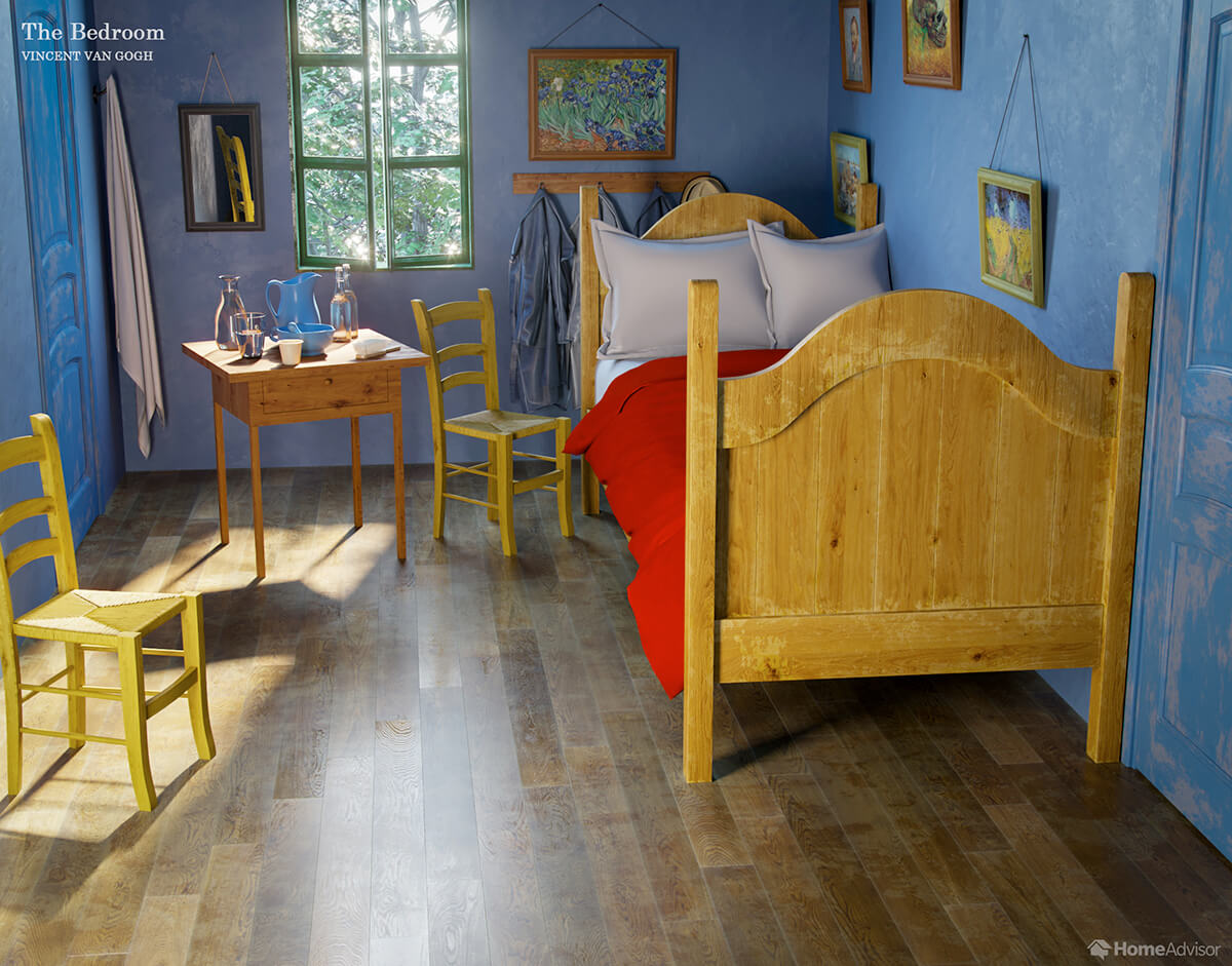
The jerky angles and inclusion of three claustrophobic walls tend to undo some of the calming effects, however. Our CG image emphasizes the use of natural light from the window, the hanging mirror, and contrasting shades of the doors, all of which create a more spacious feel.
Conservatory – Grant Wood’s ‘The Sun Shine on the Corner’
American painter Grant Wood is most famous for his ‘American Gothic’ – the painting of a farming couple outside their wooden Iowa home. If Wood’s ‘Sun Shine’ is a little less stern, it retains an element of the same rural melancholy and quietness.
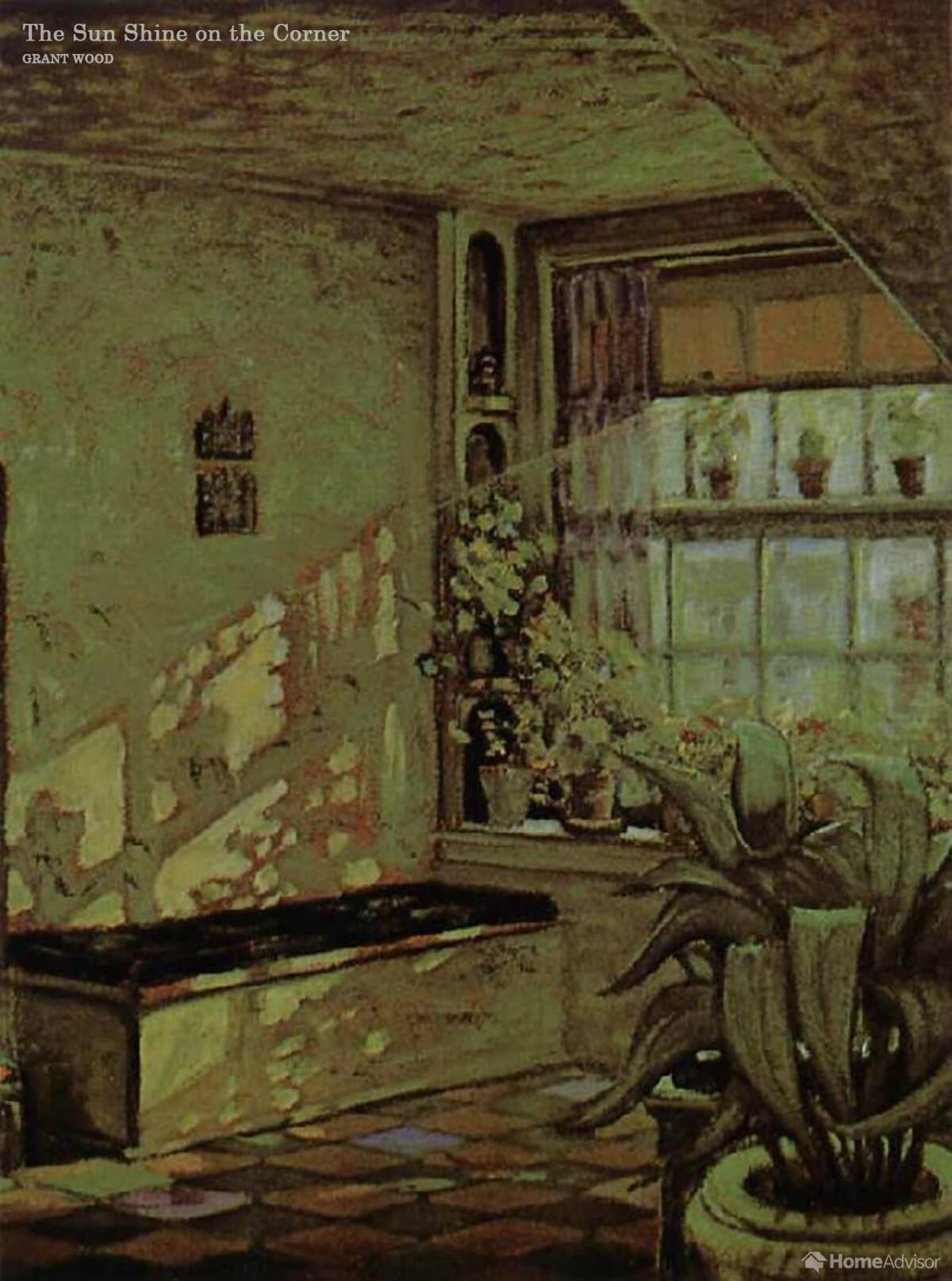
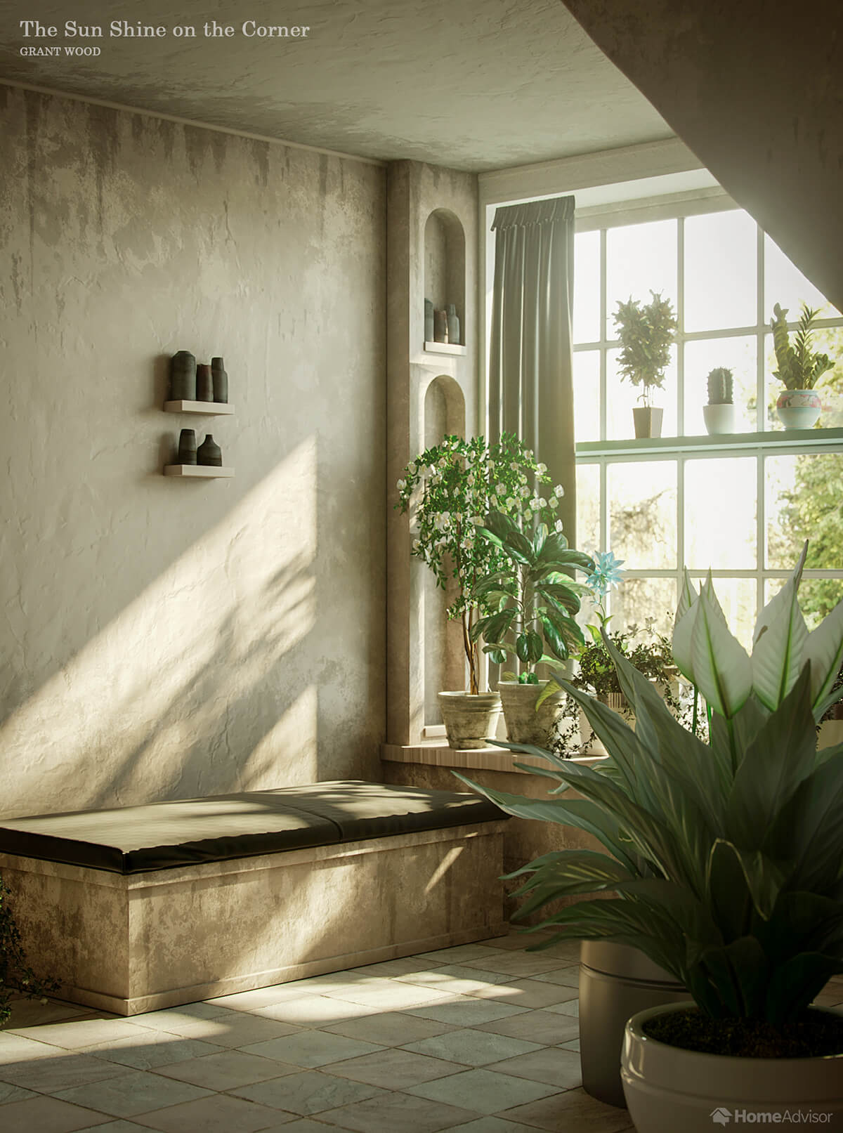
The conservatory maintains this sense of quiet while achieving an enviable level of stylishness. Wood restricted the palette to just two colors: the white of the flowers, walls, and fixtures and fittings, and the lively green of the plant leaves. Shadows, soil, and coal-colored earthenware add relief. Install a tile floor similar to the one in the painting to achieve a cool, easy-to-clean surface in any room.
Dining Room – Wassily Kandinsky’s ‘Interior (My Dining Room)’
Kandinsky was on the brink of evolving from figurative to abstract art when he painted his dining room in 1909 – and it shows. The artist was already more interested in color and shape as a kind of ‘visual music’ than as a representation of concrete phenomena.
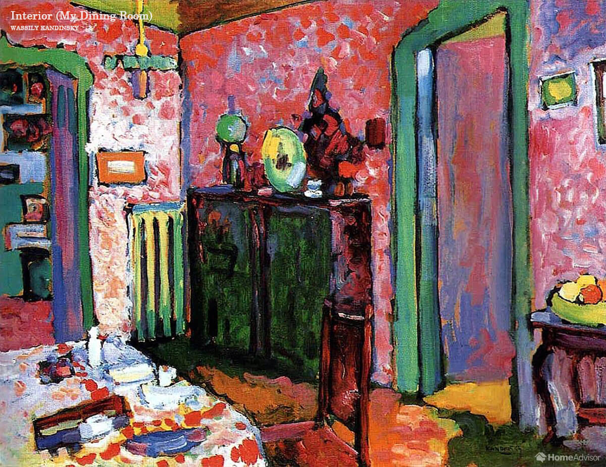
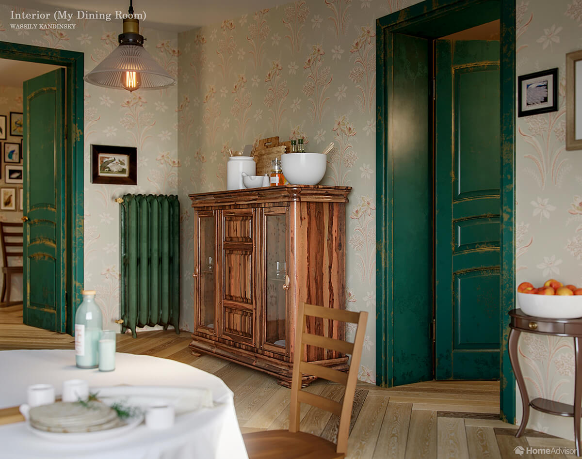
His choice of colors for this piece was likely subjective. However, the affection he feels for the space can be very inspirational for today’s swatch-wielding home decorator. The blue-green accent doors and trim help make an ordinary dining room pop. Talk to an interior designer to find the best way to incorporate a fun color into your space.
Kitchen – Konstantin Korovin’s ‘Interior’
The bare walls and wooden floor of Korovin’s impressionist kitchen stand in stark contrast to Kandinsky’s vibrant dining room. Wide-paneled wood flooring provides a sleek look that complements the more rounded, log-style walls. A local wood flooring professional can help you mimic the design at home.
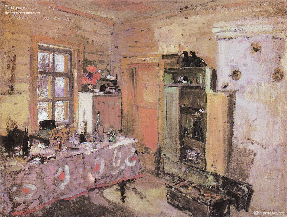
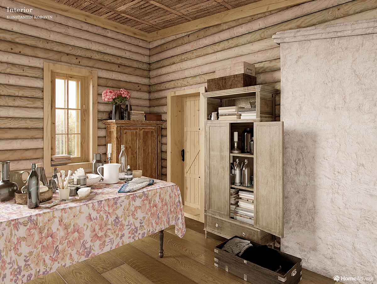
The secret here is function over form. The rustic style emphasizes the use-value of every element, with frills such as the pattern on the tablecloth adding a touch of levity.
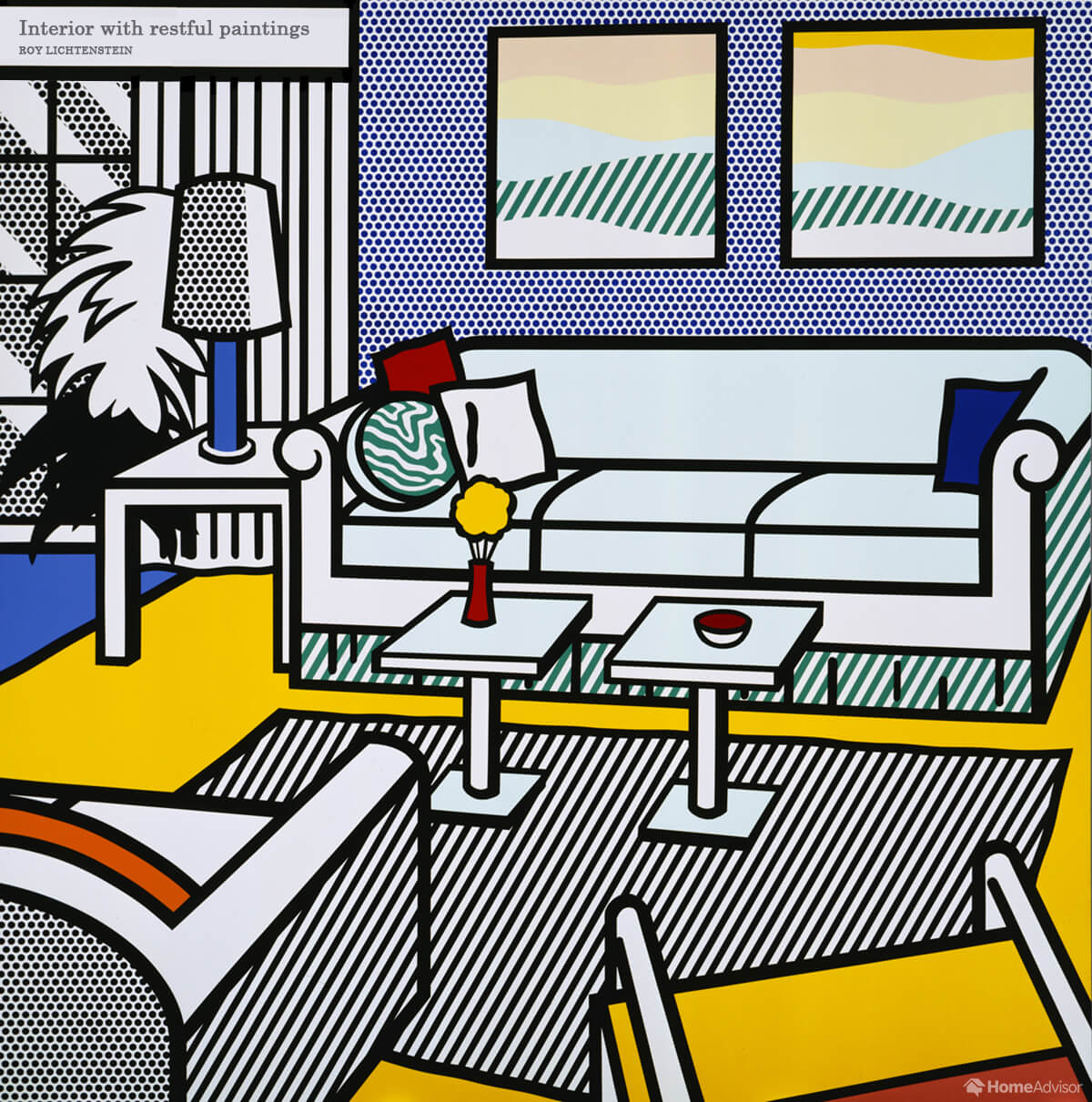
Living Room – Roy Lichtenstein’s ‘Interior with restful paintings’
Pop art pioneer Roy Lichtenstein’s living room certainly doesn’t feel very restful with his signature stripes and dots. And his 2D take is intended to evoke the flatness of a comic strip as much as the space of a real-life room.
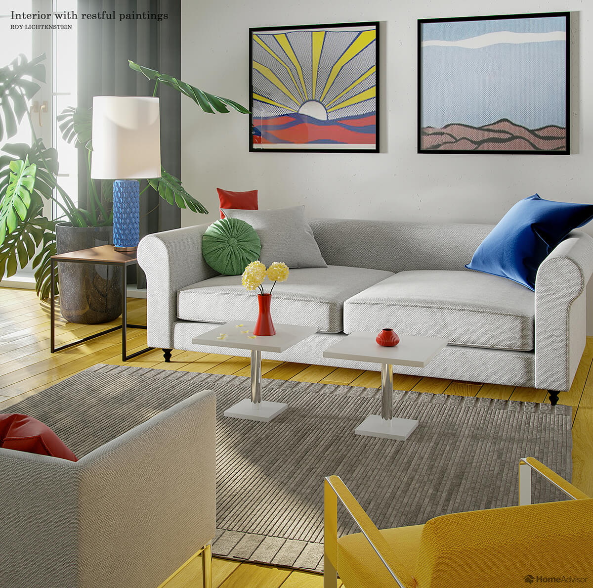
Our designers made the 3D render feel more restful by turning it inside out: they put realistic-looking décor in the room and a pair of vintage Lichtensteins on the wall in place of the artist’s ‘paintings within a painting.’ The weave of the rug and upholstery and the geometric fascia of the lamp inflate the artist’s two-dimensional shading into a more tangible 3D form.
Sitting Room – Eduard Petrovich Hau’s ‘Empress Alexandra Feodorovna’s Sitting Room, Cottage Palace, St. Petersburg, Russia’
Hau’s watercolor of the Tsarina of Russia’s sitting room looks rather posh, decorated richly with stained-glass, and gothic-revival chandelier and screens. In fact, Alexandra’s study was part of a cottage especially built for the Tsarina as a chance to “rest her eyes from all that gold” in her even more formal home at Peterhof Palace. A ceiling professional can help you incorporate the decorative ceiling shown in the image into your own space. Its intricate design adds an extra layer of interest to the room.
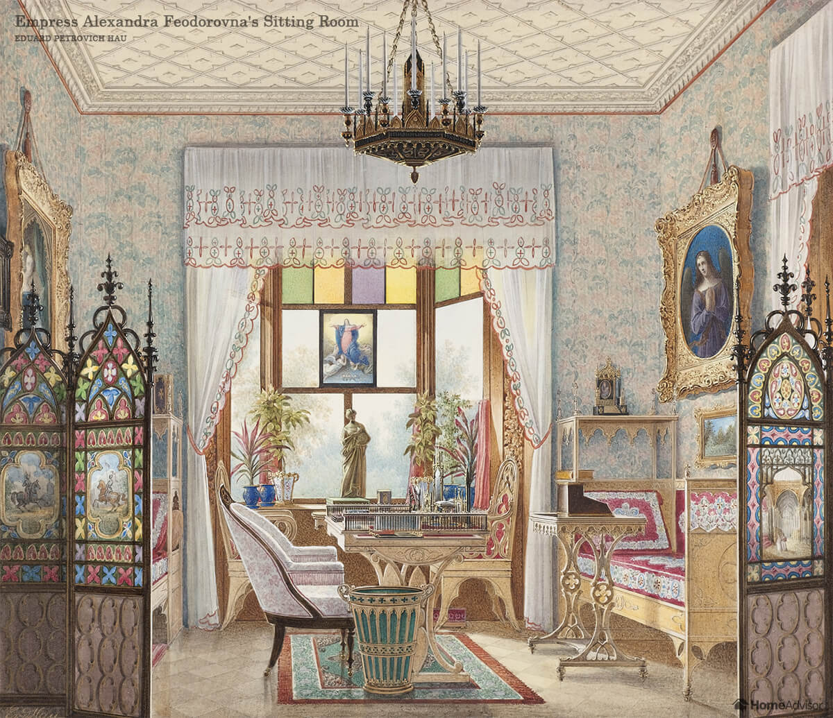
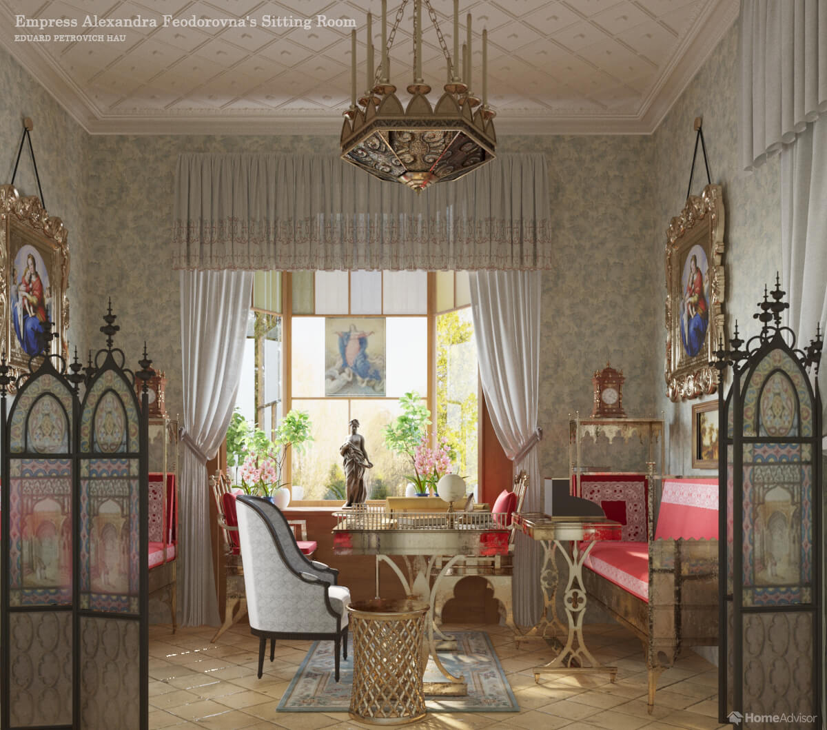
The pictures Hau painted were, themselves, almost photorealistic in style. If he had had the tools that we have today, perhaps his rendering would have looked a little bit like ours?
Why not take inspiration from these arresting interiors next time your decorating and turn your house into a work of art?
Add this graphic to your site:
- Click the text below.
- Copy the selected text.
- Paste the code on your website.
Sources
- Cooper Hewitt Collection. (2018). DRAWING, EMPRESS ALEXANDRA FEODOROVNA’S SITTING ROOM, COTTAGE PALACE, ST. PETERSBURG, RUSSIA, CA. 1835. Collection.cooperhewitt.org
- Wassily Kandinsky. (2018). Interior (My Dining Room). wassilykandinsky.net
- The Art Institute of Chicago. (2013). The Bedroom. artic.edu
- WikiArt. (2012). The Sun shines on the Corner. wikiart.org
- WikiArt. (2012). Interior. Wikiart.org
- Museu Coleção Berardo. (2018). Interior with Restful Paintings. museuberardo.pt


Are You Familiar With This Topic? Share Your Experience.